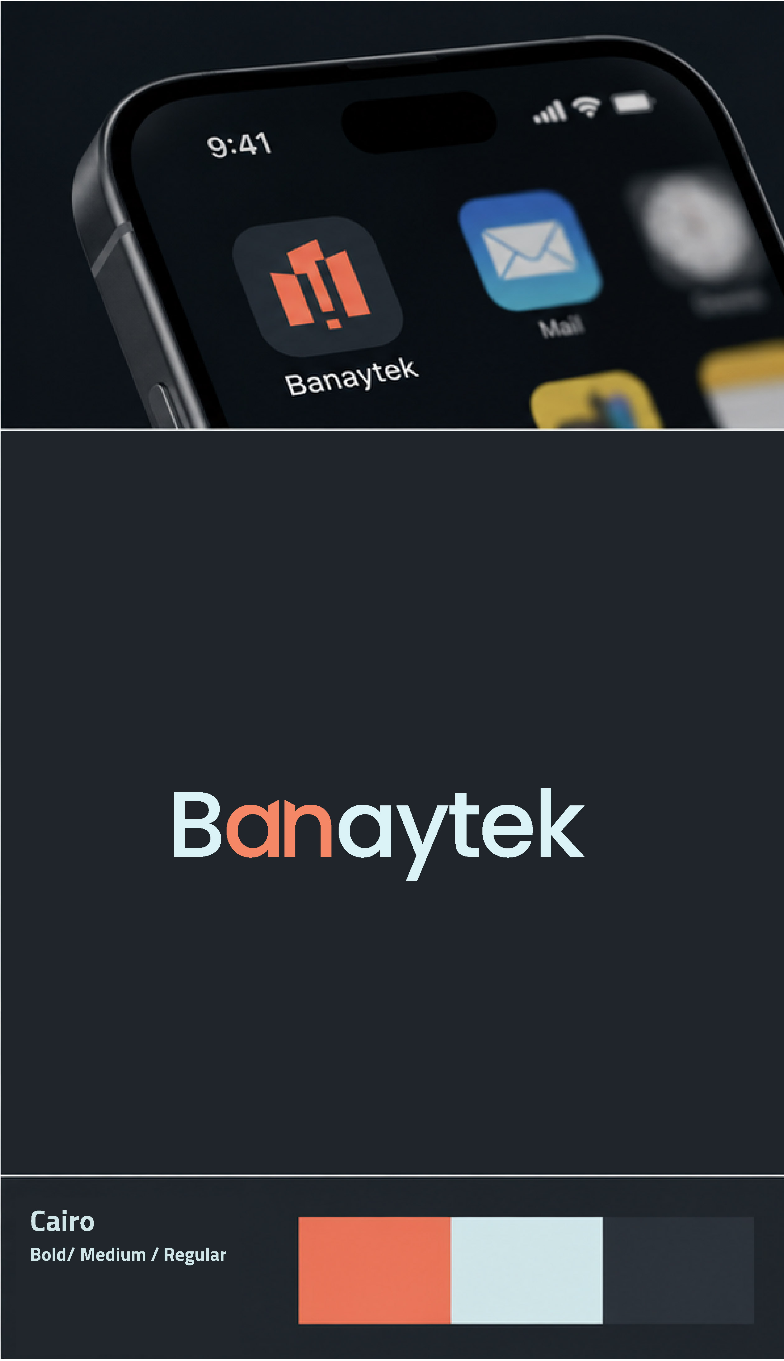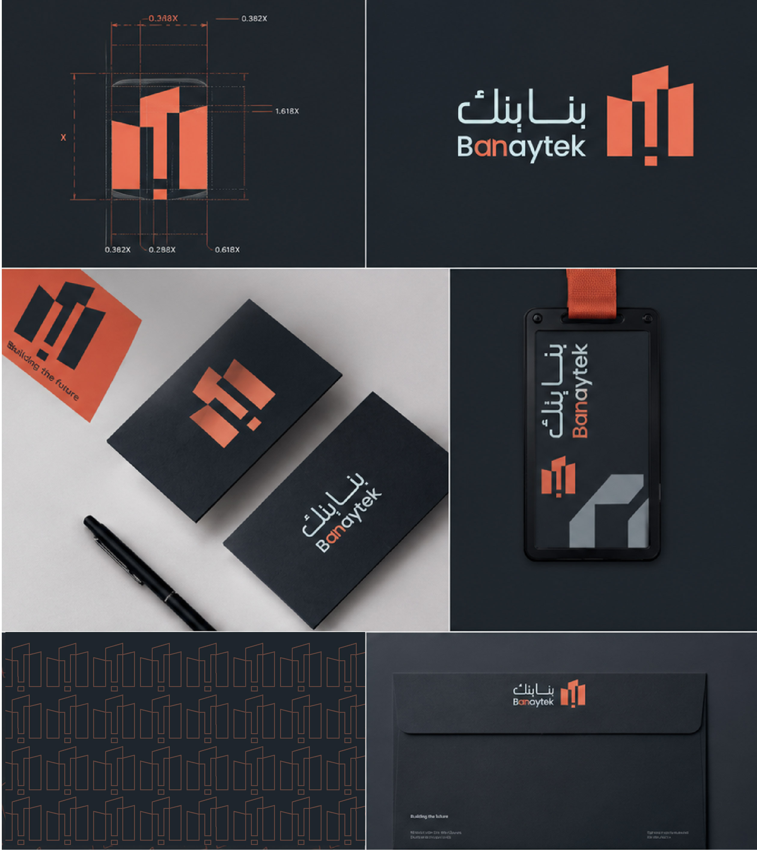
The challenge was to translate the idea of connecting two different sides of the construction industry into a distinctive and meaningful visual identity. The logo needed to communicate connection and collaboration while maintaining a clear relationship with engineering and construction without feeling overly conventional.
Brand Identity
Banaytek
Banaytek is a visual identity and website for a platform that connects project owners with engineering consultancy firms through a clear, trustworthy digital experience built around connection, construction, and collaboration.
- Client
- Type of work
- Brand Identity
- Scope
- Banaytek is a visual identity and website for a platform that connects project owners with engineering consultancy firms through a clear, trustworthy digital experience built around connection, construction, and collaboration.
- Year
- 2026
The visual identity and website for Banaytek were designed to communicate the core idea of the platform: connecting project owners with the right engineering expertise.
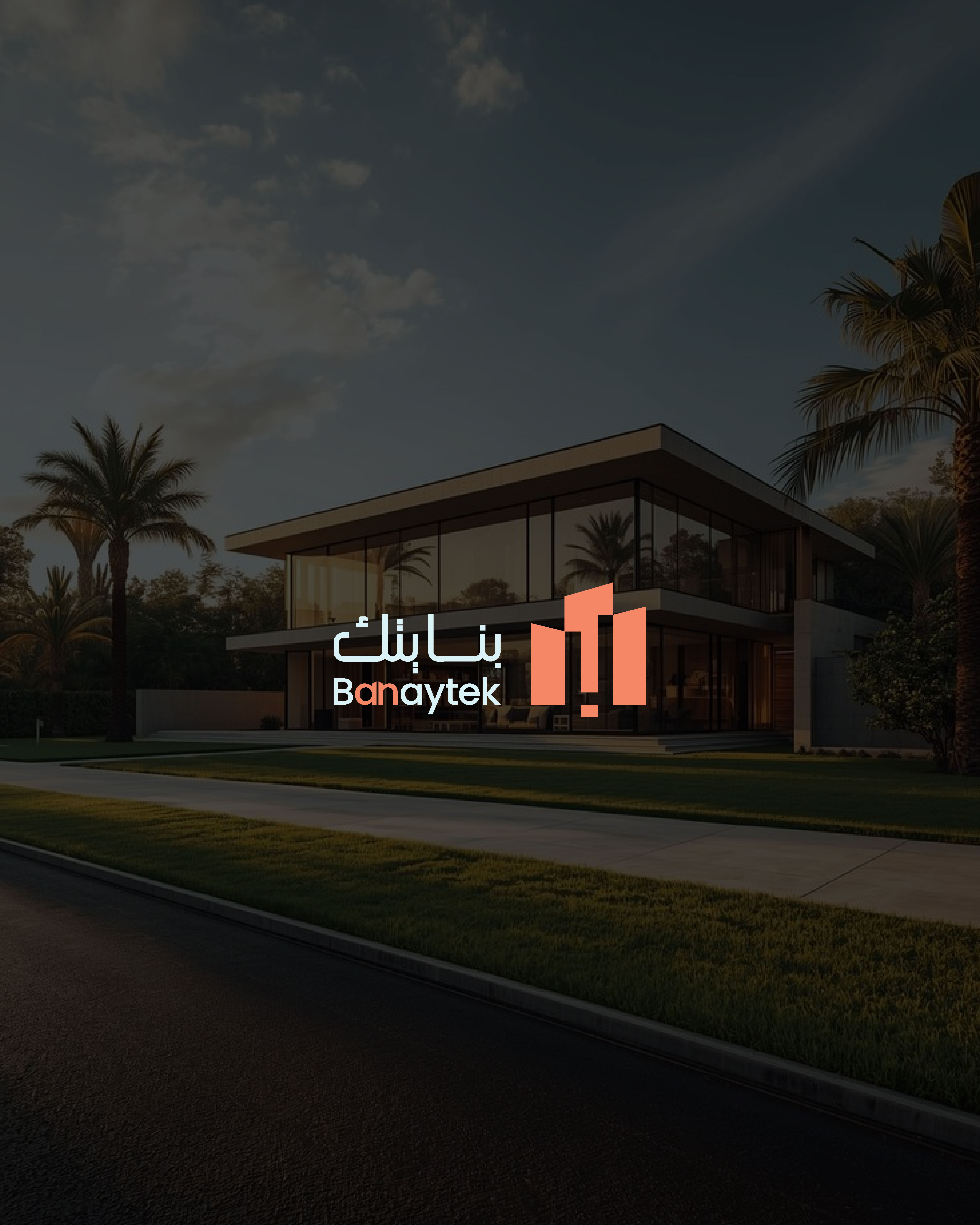
The visual identity is built around the concept of construction and connection, with the logo representing two sides coming together through Banaytek, reflecting the platform's role as a bridge between project owners and engineering consultants.
The website extends this visual language into a simple and structured digital experience, making information, services, and consultancy firms easier to explore while guiding users toward the next step with confidence.
The identity was built around the concept of connection and construction, combining architectural and engineering-inspired elements with the idea of bringing two sides together. The logo became a visual representation of Banaytek's role as a bridge between project owners and engineering consultants, supported by a cohesive visual system designed to work consistently across the website and brand touchpoints.
The result is a modern and distinctive visual identity that communicates Banaytek's purpose and establishes a recognizable presence within the construction and engineering consultancy sector. The identity was then translated into a cohesive website that maintains the same visual language while delivering a simple, clear, and structured user experience.
Gallery